Look, after 20 years chasing Silicon Valley’s endless hype cycles — from Pets.com busts to crypto winters — I’ve learned to spot when tech news is real meat or just garnish. Ubuntu 26.04 LTS? Folks expected the usual LTS fanfare: beefed-up security, PipeWire upgrades, maybe a Wayland nudge. Not icons. But here we are, with Resolute Raccoon polishing its default apps to match the Yaru theme. It’s a quiet fix, the kind that doesn’t crash headlines but keeps power users from grumbling.
What Everyone Expected from Ubuntu 26.04 — And Didn’t Get
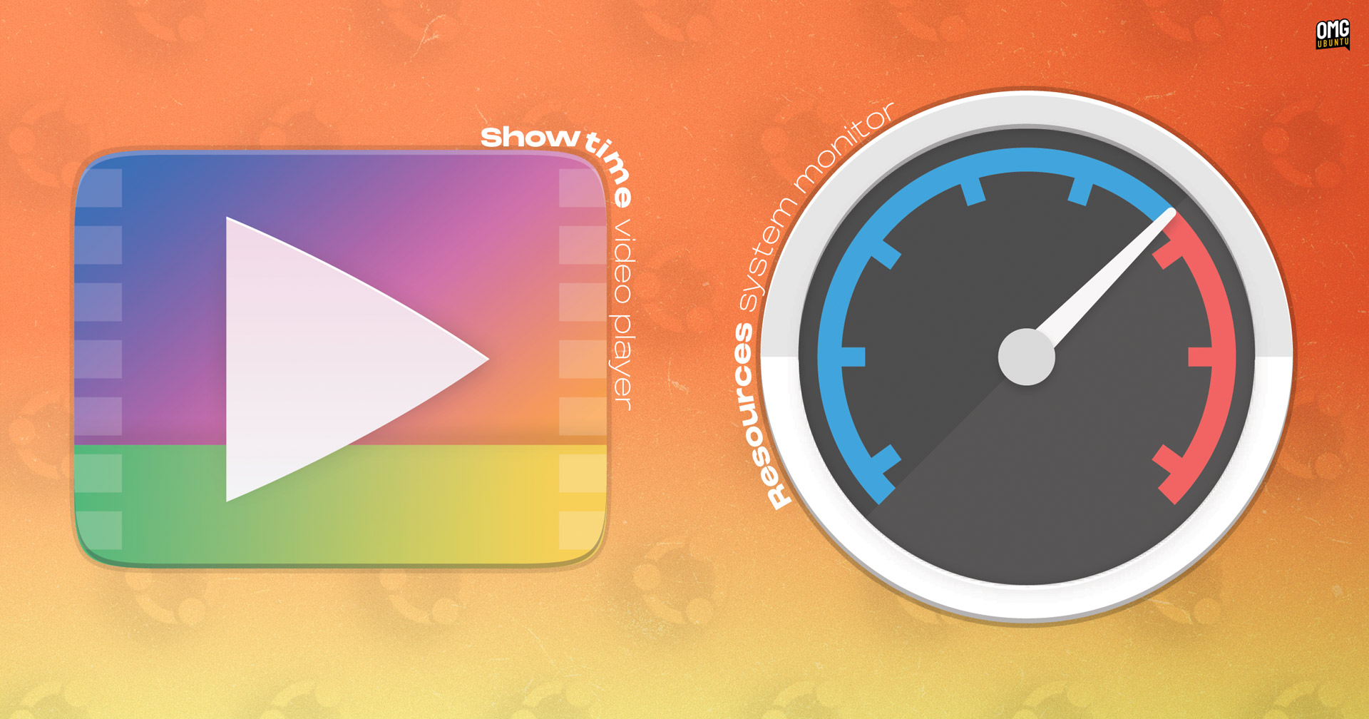
Ubuntu LTS drops are like clockwork for enterprise sysadmins: stable, boring, reliable. 24.04 brought us the ‘Noble Numbat’ with its COSMIC desktop teases and AI hype that went nowhere fast. For 26.04, whispers pointed to deeper GNOME integrations, Rust rewriting core bits, or even Canonical finally ditching snaps for something less controversial. Nope. Beta testers and daily build nerds are buzzing about… icons. Resources gets a round Yaru badge, ditching its upstream squiggle. Showtime, the GTK4 video player replacing Totem, swaps for a gaudy gradient recolor.
This changes zilch for your workflow. But it signals Canonical’s doubling down on visual unity — no more apps sticking out like sore thumbs in the grid.
And here’s a quote straight from the source that nails it:
A couple of new icons have been added to Ubuntu 26.04 LTS, to ensure the Resolute Raccoon’s new default apps sport a Yaru-ified look in keeping with the rest of the distro.
Spot on. Yaru’s been Ubuntu’s house style since 18.04, evolving from Suru with those circles, squircles, upright rectangles. Upstream icons? They never quite fit — too square, too busy. Now fixed.
Why These Icons Matter More Than You Think
But — and it’s a big but — who cares about icons in 2025? Devs SSH in blind. Enterprises lock down desktops anyway. Casual users? They’re on Mint or Pop!_OS, fleeing Ubuntu’s snap drama.
Here’s my unique take, one you won’t find in OMG!Ubuntu posts: this mirrors Windows 11’s Fluent redesign obsession. Remember how Microsoft iterated icons for YEARS post-Win10? Flat to rounded, then glassy. It wasn’t about beauty; it was retention. Canonical’s playing the same game. In a world where Fedora spins GNOME wild, and KDE Plasma laps everyone in customizability, Ubuntu needs that ‘premium’ sheen to justify LTS premiums in clouds like AWS Marketplace. Icons are cheap wins — glue users stick around longer, reducing churn to fresher distros.
Resources? Now a cleaner gauge, less clutter. Still called ‘Resources,’ not some generic ‘System Monitor’ — smart branding. Showtime? Only in expanded installs (sudo apt install showtime if you’re minimal). Labeled ‘Video Player’ in the grid, because who has time for flair?
Short para for punch: It’s fixed bugs too — snap icons in processes, memory toggles. Boring? Essential.
Are Ubuntu 26.04’s New Icons Just PR Fodder?
Cynical me asks: who’s making money? Canonical, sure — better-looking ISOs sell more Ubuntu Pro subs (that $25/year extended security). But designers? Volunteers tweaking SVGs in Inkscape, probably. No fat contracts here.
Dig deeper. Yaru’s community-driven, but Canonical steers the ship. Upstream Showtime devs get a nod with their colors, but Ubuntu recolors it gaudy-gradient style. Feels like that time Apple ‘borrowed’ Xerox PARC ideas — respectful theft for cohesion.
Historical parallel: Ubuntu 10.04 (Lucid Lynx) nailed the brown-orange theme, boosting adoption pre-Unity fiasco. Icons were crisp then; sloppiness now would’ve echoed those dark days. Prediction? 26.04’s polish foreshadows COSMIC desktop maturity by 26.10. If they nail it, Ubuntu reclaims ‘easiest Linux’ crown from Zorin.
But snaps still suck. Icons won’t fix that.
Users on 26.04 beta or dailies: hit Software Updater or apt update && apt upgrade. Yaru theme pulls the goods.
Why Does This Matter for Linux Desktop Users?
Power users, rejoice — or yawn. Consistency fights ‘desktop schizophrenia,’ where apps look like they wandered from different eras. Resources update also squashes glitches: errant snap icons gone, ‘Combined Memory’ toggle works.
Expanded install gets Showtime preloaded; minimal folks apt it up. GTK4/libadwaita means future-proofing — Totem’s ancient.
Skeptical angle: Is ‘Yaru-ified’ code for ‘Canonical-ified’? Upstream purity dies a little. But hey, if it looks good on your ThinkPad, who complains?
Compare to macOS Sonoma icons — all squircle perfection. Linux catching up, slowly.
One-sentence wonder: Icons won’t save Ubuntu from Red Hat’s RHEL paywall, but they’re a start.
We’ve covered the tweaks. Now, real talk on broader 26.04: expect PipeWire 1.2, kernel 6.11-ish, GNOME 48. No AI fluff — thank God. Canonical’s PR spins ‘AI-ready,’ but it’s vapor. These icons? Tangible progress.
🧬 Related Insights
- Read more: Claude Code: The AI Agent That Edits Your Real Codebase, Not Just Chat Fantasies
- Read more: Ditching Date Libraries: Native JavaScript Conquers Timezone Chaos
Frequently Asked Questions
What are the new icons in Ubuntu 26.04 LTS? Resources gets a round Yaru template with simplified gauges; Showtime uses a recolored Totem gradient.
How to install new icons on Ubuntu 26.04? Run apt update && apt upgrade, or use Software Updater — they’re in Yaru theme updates.
Does Ubuntu 26.04 replace Totem with Showtime? Yes, in expanded installs; it’s GTK4, fancier, installable anytime via apt.