Ubuntu 26.04 folder icons were supposed to be the star of last week’s Yaru theme refresh. Developers fired up their test builds, saw squatter, full-color glyphs swapping out the old slate ones, and thought: finally, some vibrancy.
But.
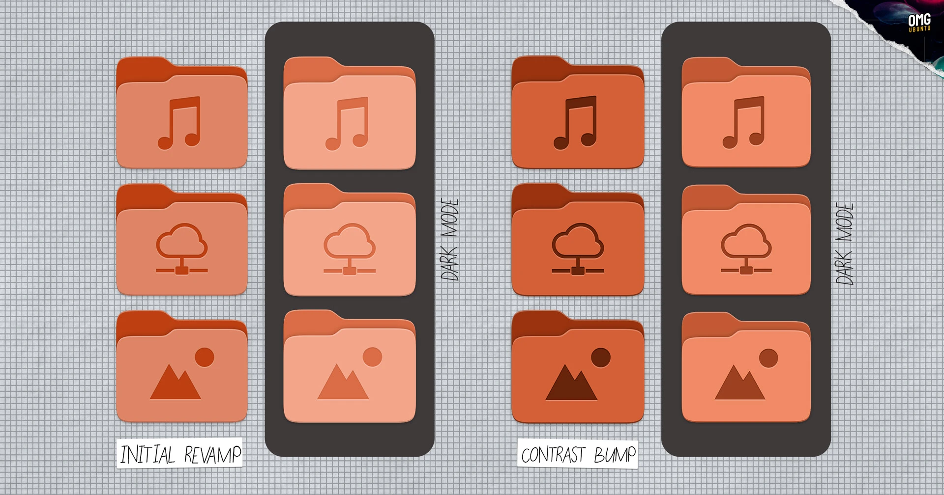
Feedback poured in — too light, emblems fading into the background, especially flipping between light and dark modes. So the Yaru team — Vincent Renzo Quilon (ochi12), Marco Trevisan from Canonical, and crew — looped back quick. New set drops: colors punched up, insets darkened. It’s like they heard every nitpick and cranked the dial.
Here’s the before-and-after vibe. Default orange accent? Now it pops without screaming. Music folder’s emblem sits crisp, not lost in a pastel haze.
Why Revamp Folder Icons — Again? So Soon?
Look, folder icons aren’t rocket science. But in Linux land, they’re battlegrounds. Back in 2019, Yaru went slate — safe, modern, a bit meh. Last week: full color explosion, echoing old-school GNOME vibrancy but squatter, accent-tinted. Users loved the shift (mostly), groaned at the subtlety.
“Contrast has been increased for all folder colours (default orange accent colour set pictured below) in both light and dark mode, and the inset pictograms made darker (most notably under dark mode versus the previous iteration).”
That’s straight from the update notes — no fluff, just facts. And it works. Dark mode emblems? Night-and-day from the washed-out first pass.
This isn’t just pixel-tweaking. It’s the open-source machine humming: ship early, iterate fast, listen. Ubuntu 26.04 LTS lands April 2026 — plenty of runway, but momentum matters.
Squint at history. Remember Mac OS X’s Aqua days? Glossy folders that screamed ‘future.’ Linux desktops have chased that polish forever — Unity’s dash, GNOME’s shell evolutions. These icons? A quiet nod to that quest. They’re not flashy animations, but they make file browsing feel alive, not utilitarian drudge.
My bold call — one you won’t find in Canonical’s patch notes: this could tip Ubuntu into ‘daily driver for creators’ territory. Imagine devs, designers, AI tinkerers staring at these all day. Subtle joy compounds. Poor contrast grates; this sings.
Do These Changes Fix Linux’s ‘Ugly’ Rep?
Short answer: closer.
Linux desktops battle macOS sheen and Windows gloss. But here’s the thing — Ubuntu’s never been about bling. It’s rock-solid under the hood. Yet, first impressions? Folders are ground zero.
The new set nails XDG standards: Downloads as a zippy arrow-down, Pictures a frame, Music notes dancing. Engraved emblems add depth — like embossed leather on a journal. Light mode: vibrant without neon assault. Dark: moody, pro.
Critics might scoff — icons? In 2025? But zoom out. We’re in a platform shift where desktops blend with AI workflows, Wayland matures, snaps proliferate. Polished UIs lower friction. That orange folder winking at you? It says, ‘Hey, this ain’t your grandpa’s terminal.’
And the process. Cheeky original post noted: “you’ll have opinions.” Spot on. Forums lit up — too light! Too orange! Now? Consensus tilts positive. It’s returning to colored roots, smarter.
What Ubuntu Users Are Saying — Raw Takes
Twitter, Reddit: mixed but trending up. One dev: “Finally, folders that don’t vanish in dark mode.” Designer gripes linger — “emblems still busy” — but most cheer the responsiveness.
Canonical’s not hyping this as earth-shattering (smart). It’s iterative gold. Marco Trevisan coordinated; Vincent led design. Team effort, no ego.
Prediction time — my unique spin. By 26.04 stable, these stick, spawn variants for flavors like Kubuntu. Watch adoption spike among switchers from Big Tech OSes. Small tweak, massive ripple: Linux feels welcoming, not workshoppy.
Wander a bit: think iOS icon evolutions. From skeuomorphic to flat to depth returns. Ubuntu’s tracing that arc — slate was flat era; color’s the bounce-back. Feels right.
The Bigger Yaru Refresh Picture
This ain’t solo. Last week brought consistent radii, bolder text, dock opacity off by default. Cohesive. Ubuntu’s chasing ‘just works’ elegance without reinventing wheels.
Dark mode mastery? Check. Accent integration? smoothly. It’s building a theme that ages well — critical for LTS, three-year haul.
Skeptics: is orange default forever? Customize away, folks.
And the wonder: open design in action. Patch, feedback, polish. While closed ecosystems dictate from on high, here we co-create.
🧬 Related Insights
- Read more: ClassPilot v2.0.3: Liquid Glass Glow-Up and AI Smarts for Stressed Students
- Read more: AI Safety Index Hands Failing Grades to AI Giants
Frequently Asked Questions
Will Ubuntu 26.04 folder icons work on older versions? No, tied to Yaru update in 26.04 dev branch. Backport possible via PPAs.
How do I test the new icons now? Grab daily ISO or update dev VM. Yaru-purple for purple fans.
Are there custom folder icon themes better? Plenty — Papirus, Numix. But stock’s catching up fast.