What if the buzzword everyone’s chasing – AI – looks exactly like a guy’s name on half the websites you visit?
Ever tried reading tech headlines on your phone, only to pause because ‘AI’ morphs into ‘Al’? It’s not your eyes. It’s webfont legibility, that stubborn glitch where lowercase ‘l’ and uppercase ‘I’ bleed together in too many digital typefaces. And here we are, deep into 2026, with European Accessibility Acts and WCAG mandates stacking up like unread emails, yet the web’s still half-blind.
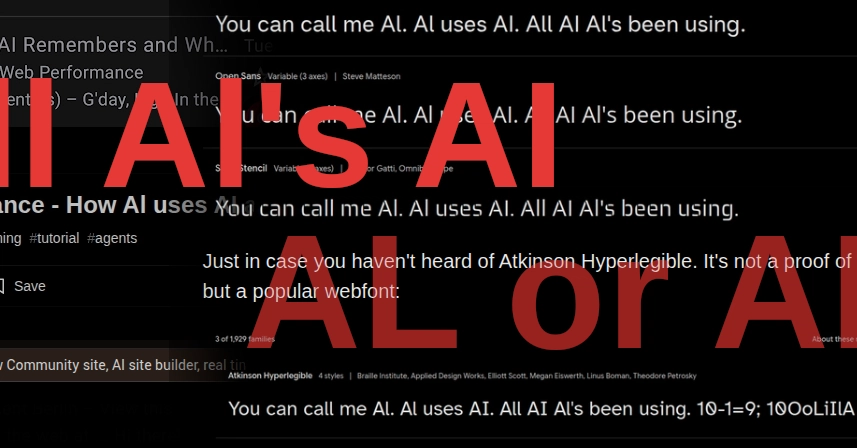
Look, this isn’t some nitpick for pixel peepers. It’s a core failure in how we build the digital world – one that hits dyslexic users, low-vision folks, and anyone glancing at a mobile screen hardest. The original post that’s got folks chuckling? It points to screenshots where ‘Al’ parades as ‘AI’ everywhere from dev blogs to site builders. Punchy joke, sure. But underneath? A scream about architectural laziness in frontend stacks.
Who’s This ‘Al’ Guy Taking Over AI Headlines?
Al’s not a person – he’s a phantom born from bad letterspacing. Fire up Chrome, hit a site using default Ubuntu or half the Google Fonts lineup, and bam: ‘AI Guidance’ reads like ‘Al Guidance’. Nadia Makarevich’s post nails it – her AI article looks crystal clear… until your Android email client strips context and turns it mushy.
“AI (not Al) of course, but in most web fonts you can’t visually tell the difference. You still can’t. In 2026.”
That’s the raw frustration. Decades after legibility crusaders like Matthew Carter pushed humanist type, we’re still serving slop.
Atkinson Hyperlegible? Yeah, it’s out there – Apple’s gift to readability, now a webfont darling. Ubuntu tries with subtle elegance, but defaults? They flop. Add ‘(not Al)’ to any AI headline, and suddenly clarity snaps back. Why isn’t this baseline?
But here’s the thing – and my unique angle no one’s hammered yet: this echoes the Netscape kerning wars of the ’90s. Back then, browsers mangled fonts so bad that designers coded images for headlines. We solved that with @font-face and WOFF. Yet today, with infinite CSS tweaks possible, we’re repeating history. Font foundries chase trendy ligatures over plain legibility, and devs grab freebies without auditing. Prediction: WCAG 3’s APCA contrast algo will finally price out the lazy stacks, forcing a webfont renaissance – or a black market for compliant type.
One sentence: Brutal.
Dig deeper, though. WCAG 2’s success criteria? They mandate 4.5:1 contrast, but say zilch about character distinction. APCA shifts to perceived contrast, promising better handling of light text on dark – great for gradients, lousy if your ‘I’ and ‘l’ are twins. Legislation like the 2025 European Accessibility Act piles on fines for non-compliance, yet enforcement lags. US Section 508? Same story. We’ve got the rules; we’re missing the cultural gut-punch.
Why Does Webfont Legibility Still Fail Developers in 2026?
Fonts aren’t just pretty pixels – they’re architecture. Type designers balance aesthetics with function, but web constraints warp everything. Hinting for screens? Often ignored in variable fonts. Subpixel rendering? Firefox ditched it; Chrome clings. Result: ‘AI’ dissolves on Retina displays or zooms.
And devs? We’re culprits too. Tailwind’s utility classes spit out fonts without legibility checks. Next.js templates default to system stacks that crumble cross-device. Real-time collab tools like the ones teasing ‘Al site builders’? They amplify the mess, letting teams ship ambiguous type at warp speed.
So, how to audit? Tools like WebAIM’s contrast checker miss this; try TrueFont or browser devtools with zoomed text. Swap to Charter, Iowan, or yes, Atkinson. But why wait for mandates? It’s a shift: treat fonts like security – vet ‘em upfront.
Critique time – the industry’s PR spin on ‘accessible by default’ is hype. Google Fonts labels ‘em ‘optimized’, but test ‘AI’ in Inter or Roboto: disaster. They’re banking on users not noticing, or blaming zoom settings. Callout: that’s not innovation; it’s negligence.
Short para. Boom.
Now sprawl: Imagine a dev workflow where legibility scores auto-flag PRs, APCA baked into linters, foundries competing on ‘Al-proof’ metrics. That’s the underlying shift – from cosmetic CSS to metric-driven type systems. Until then, every ‘AI’ tweet risks reading like a shoutout to some engineer named Al.
Can WCAG 3 and APCA Finally Fix This Font Mess?
WCAG 3 awaits, with APCA as its contrast kingpin. It models human vision better – luminance, chroma, hue in one formula. For webfonts? It could penalize low-distinction pairs, pushing adoption of hyperlegible faces. But here’s the rub: implementation’s on us. Browsers need engine buys-in; devs, education.
Historical parallel? CSS Grid killed table hacks overnight. APCA could do that for fonts – if championed right.
Test it yourself: Grab Figma, mock ‘AI’ in 20 fonts, score with APCA tools. You’ll see the chasm.
One word: Wake. Up.
🧬 Related Insights
- Read more: Cursed Powers: The AI Genie App That Over-Engineers Useless Superpowers
- Read more: Context Graphs: Finally Answering ‘Why’ or Just Graph Hype?
Frequently Asked Questions
What causes ‘AI’ to look like ‘Al’ in web fonts?
Primarily, similar stroke widths and shapes between uppercase ‘I’ and lowercase ‘l’ in sans-serifs like Roboto or Ubuntu, exacerbated by screen rendering and no kerning tweaks.
Will WCAG 3 fix webfont legibility issues?
It’ll help via APCA’s better contrast model, but success hinges on dev adoption and browser support – don’t hold your breath without audits.
What’s the best hyperlegible webfont for AI-heavy sites?
Atkinson Hyperlegible leads, with alternatives like Charter or OpenDyslexic; always test cross-device before deploying.