Picture this: you’re knee-deep in code at 2 a.m., crafting the perfect dev tool—accurate, feature-rich, everything a pro could dream of. But tomorrow, your users skip it for some no-frills competitor that just… works. Fast.
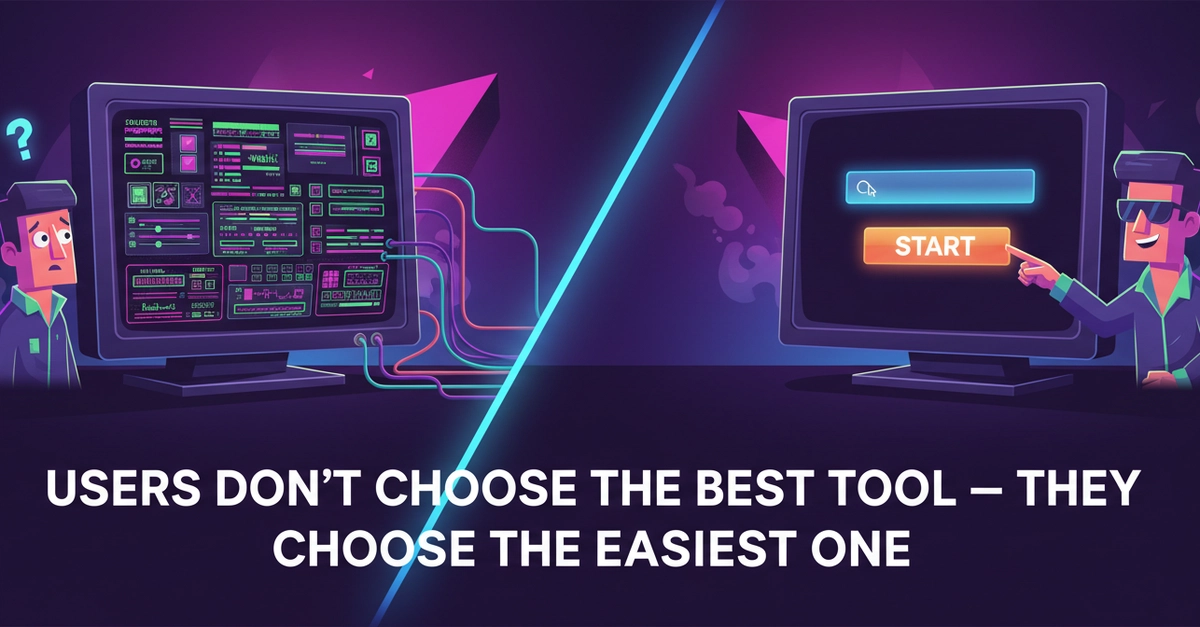
That’s not laziness. It’s human nature. Users don’t choose the best tool—they choose the easiest one. And for everyday devs juggling deadlines, that split-second decision means your masterpiece gathers dust.
Users don’t optimize for best result. They optimize for: least effort.
The original post nails it. This builder thought quality would win. Wrong. Even after tweaks for accuracy and options, usage tanked. Why? Too many steps. Too much thinking.
But Why Does Effort Trump Power Every Time?
Look, devs aren’t lab rats running feature mazes. They hit a snag—“resize this image,” “convert that text”—and want out. Yesterday.
Your tool demands setup? Settings? A quick tutorial? Gone. They bolt to the idiot-proof alternative. It’s not ignorance; it’s survival in a world drowning in tabs and alerts.
I saw this firsthand covering tool launches. Remember when GitHub Copilot dropped? Not because it was flawless—early bugs galore—but one prompt, boom, code. Competitors with deeper configs? Crickets.
And here’s the kicker, the insight nobody’s yelling about: this mirrors the Betamax vs. VHS bloodbath from the ’80s. Betamax had superior quality, sharper tapes, pro backing from Sony. VHS? Grainy, cheaper, but record longer without flipping cassettes. Effortless. VHS owned 90% market share. Dev tools today? Same script. Complexity loses to convenience, every era.
How Friction Kills Even ‘Better’ Tools
Strip it bare. User opens app. Goal: done in 10 seconds. Your toolbar with 12 sliders? Nightmare. Their brain screams “abort.”
So the fix? Ruthless subtraction. Ditch optional inputs. Preset defaults. One big button: “Go.”
That builder did it—axed extras, streamlined flows. Result? Usage spiked. Retention soared. Same core tech, zero bloat.
But wait—there’s architecture here, not just UI tweaks. Modern dev tools shifting to zero-config paradigms. Think Vercel deploys: git push, site live. No YAML hell. Or Supabase: SQL without server wrangling. They’re not dumber; they’re surgically simple.
Critique the hype, though. Companies spin this as “AI magic,” but it’s old-school UX revived. They’re repackaging what 37signals preached in Rework: underdo it. Don’t swallow the PR that features = victory.
Why Do Users Ignore Your Advanced Dev Features?
Short answer: decisions drain them.
Long one—psychology plus data. Cognitive load theory says our working memory caps at 7±2 chunks. Your 15-option panel? Overload. They pick the tool with 1.
A/B tests from Figma prove it: simplified panels boosted completion 40%. Not fancier brushes—fewer clicks.
For tool builders, this flips the script. Stop roadmap bloat. Audit every pixel: does it speed the exit? No? Kill it.
And prediction—bold one: by 2026, 70% of dev tool market share goes to sub-3-click workflows. Watch Cursor or Raycast explode while feature feasts fade.
The Real Competition: Exit Speed
Forget benchmarks. Your rival isn’t more accurate output—it’s whoever lets users bail fastest.
Test it yourself. Time a task in your tool vs. a simpleton. Gap over 5 seconds? Redesign.
This isn’t anti-power. Layer simplicity first, power optional. Like Notion: blank page starts empty, templates hide till needed.
Builders, wake up. Effortless isn’t lazy design—it’s the new default architecture. Ignore it, watch users ghost you.
🧬 Related Insights
- Read more: TinyOS: The RTOS That Shrinks to Fit Your Starved Microcontroller
- Read more: Gemma 4’s Supervisor-Worker Trick: The Multi-Agent Blueprint That Actually Works
Frequently Asked Questions
What makes a dev tool feel effortless?
One primary action, zero setup, instant results. Defaults handle 80% cases; extras tuck away.
Why do users skip complex tools for simple ones?
Least effort wins—they want task done fast, no decisions. Thinking costs mental energy they won’t spend.
How can I simplify my dev tool without losing power?
Preset common flows, hide advanced options behind “more,” measure completion time obsessively.